In a Nutshell
The Bass Model is the most widely cited and applied new-product diffusion model. It has been used to forecast the diffusion and sales of many types of new products (including services) and technologies. The Bass Model was developed and published by Professor Frank M. Bass.
What Do I Have to Do with the Bass Model?
I had used the Bass Model long before I met its creator. I had used it to forecast a variety of products (e.g., PCs, microprocessors, cellphones, DRAM chips, video titles, software). I have even worked on litigation matters where an important issue was the appropriate and correct use of the Bass Model to make the forecast that served as the basis for damages calculations. My quest to build a tool to ease the complexities of new product sales forecasting for us forecasters in the trenches, led me to my first meeting with Frank Bass. That meeting resulted in collaboration on scholarly research and eventually marriage ended by his death in 2006. Frank and I funded Frank M. Bass Institute (DBA Bass’s Basement), a 501c3 corporation that provides educational information concerning the Bass Model.
Origins of the Bass Model
The Bass Model was first published in 1963 by Professor Frank M. Bass as a section of the scholarly paper A dynamic Model of Market Share and Sales Behavior. The section entitled “An Imitation Model” provided a brief, but complete, mathematical derivation of the model from basic assumptions about market size and the behavior of innovators and imitators. The paper did not provide empirical evidence in support of the model, which was provided later in the 1969 Bass Model paper.
When Professor Bass first published the Bass Model, a mathematical theory of product and innovation diffusion was just being born. Three years before in 1960, Fourt and Woodlock had published their pioneering paper about the diffusion of frequently purchased products. In 1961 Mansfield’s now classic paper appeared.
In 1962 the first edition of Professor Everett M. Rogers’ pioneering book Diffusion of Innovations was published. As was the norm in sociology at the time, Rogers’ thoroughly descriptive work was largely literary and did not include a mathematical theory. Professor Bass, then a professor at the Krannert School at Purdue University, had been reading Rogers’ book thinking about how word-of-mouth applied to sales of new products when Peter Frevert (then an economics student, now retired from University of Kansas) came to Professor Bass’ office to ask how one would express mathematically the idea of imitators and innovators espoused by Rogers in the speech he had recently given at Purdue.
In response to Frevert’s question, Professor Bass thought
“The probability of adopting by those who have not yet adopted is a linear function of those who had previously adopted.”
He scratched out on a notepad the mathematical expression of this idea
as
Later, as Professor Bass manipulated the equation with the goal of finding the solution to this nonlinear differential equation, he discovered that if instead of the constant q he made the constant be q divided by the constant potential market M (in the well-established tradition of cleverly chosen constants), the equation would work out very nicely; thus, the Bass Model principle became
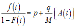
Professor Bass called p the “coefficient of innovation” because it did not interact
with the cumulative adopter function A(t). The coefficient that was multiplied
times the cumulative function was called “the coefficient of imitation” because it reflected the influence of previous adopters. We will later define these symbols and their relationships.
Bass saw that Rogers’ work on the spread of innovations in social systems due to word of mouth could be the basis of a new mathematical theory of how new products diffuse among potential customers. The Bass Model assumes that sales of a new product are primarily driven by word-of-mouth from satisfied customers. At the launch of a new product, mostly innovators purchase it. Early owners who like the new product influence others to adopt it. Those who purchase primarily because of the influence of owners are called imitators.
In 1967 Professor Bass wrote a Purdue working paper that provided empirical support for the model. It has his handwritten notes and additional empirical cases over the 1969 paper. The working paper became the classic Bass Model paper, which was published in 1969. It expanded the theory and provided empirical support. The paper became one of the most widely cited paper in marketing science. It was named by INFORMS as one of the Ten Most Influential Papers published in the 50-year history of its flagship journal Management Science. On this occasion Professor Bass wrote a retrospective.
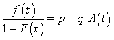
The Bass Model Principle
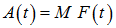
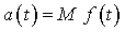
The Bass Model principle is
This is read
“The portion of the potential market that adopts at t given that they have not yet adopted is equal to a linear function of previous adopters.”
In the above equation, t represents time from product launch and is assumed
to be non-negative.
An adoption is a first-time purchase of a product (including services) or the first-time uses of an innovation.
The three Bass Model parameters (coefficients) that define the Bass Model
for a specific product are:
- M — the potential market (the ultimate number of adopters),
- p — coefficient of innovation and
- q — coefficient of imitation.
The potential Market M is
the number of members of the social system within which word-of-mouth from past adopters is the driver of new adoptions. The Bass Model assumes that M is constant, but in practice M is often slowly changing.
Because in the Bass Model each adopter is assumed to make one and only one adoption, the terms mathematical term A(t) and a(t) can be thought of as either adoptions or adopters.
The coefficient of innovation p is so called because
its contribution to new adoptions does not depend on the number of prior adoptions. Since these adoptions were due to some influence outside the social system, the parameter is also called the “parameter of external influence.’
The coefficient of imitation q received its moniker because
its effect is proportional to cumulative adoptions A(t) implying that the number of adoptions at time t is proportional to the number of prior adopters. In other words, the more people talking about a product, the more other people in the social system will adopt. This parameter is also referred to as the “parameter of internal influence.”
Bass Model parameters for products with a sales history long enough to include the peak in adoptions are determined by curve fitting the model to time series data for sales. A database of parameter estimates for such historical products are then used as a basis for guessing the parameters for a new product, the “forecasting by analogy” method. For a new product, the potential market M is also often determined using marketing research (e.g., surveys). The Bass Model parameters can be refined as actual sales data becomes available.
The other variables in the Bass Model principle above, which are calculated from M, p, q and t, are:
- f(t) — the portion of M that adopts at time t.
- F(t) — the portion of M that have adopted by time t,
- a(t) — adopters (or adoptions) at t and
- A(t) — cumulative adopters (or adoptions) at t.
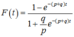
There are other representations of the Bass Model using different symbols and what may seem to be a different equation, but they are all equivalent and can be obtained from the Bass Model principle through algebraic manipulation. One equivalent equation is shown below.
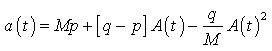
The preferred Bass Model equations for use in curve fitting and forecasting
is the solution to the differential equation, mathematically it is
Want the Details on the Bass Model Derivation?
For additional information on these formulae, see the Bass Math page at bassbasement.org.
The Forecast Joy App implements the Bass Model.
Frank Bass
 Using Bass Model Calculator Online, under the Product Database tab, use the lower right filter to select the interval (e.g., Monthly). For some intervals, additional filters must be set to specify just one product. Once a single product is selected, the graphs and parameter sliders will update to reflect the parameters for the selected product.
 The following steps will build a forecast for the (inevitable) Internet of Pugs Cloud Service:
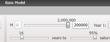 3. Specify M, the potential market, which is the number of pugs that will ultimately be connected to the Internet and subscribe to the Pug Cloud Service. I will assume (1) the number of pugs worldwide is 4 million (I have no clue except for the one under my desk) and will remain constant for the period of the forecast. I will further assume that ultimately 50% of all pugs will be connected to the Internet. Of course, all owners will want their pug connected; however, not everyone will be able to afford the connecting device and service. In conclusion, I will use the potential market M as 2 million; therefore, slide the M slider to the far right as shown.
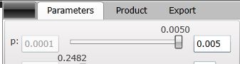 5. Specify p as the percentage of the potential market M that will be sold in the first full year of sales. I’ll say 0.5%, which means p = 0.005. Do this by either moving the p slider to select 0.001 or (as a shortcut) specify the maximum value of p in the box to the right of the slider and move the slider to the far right.


